Beauty Bar (http://beauty-bar.appspot.com) is a tool to build nice bar charts. This blog shows example charts made with the tool, and gives tips how one can use it.

Wednesday, March 24, 2010

Google Docs integration

Beauty Bar charts can be used with Google Docs spreadsheet (http://docs.google.com). One can first gather data and edit it with spreadsheet application, and then when data is ready for use create a chart to help visualize data. It is simple and powerful way to express interesting data points. And as we all know good looking document gives professional feeling. That is the reason why one should not use dull looking default charts - and that is the whole reason behind Beauty Bar.


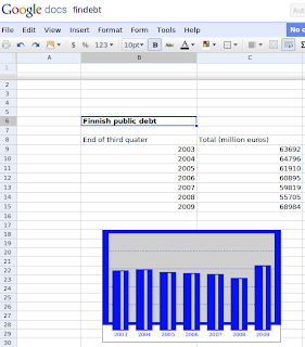
So, let's take an example. Here we want to see how Finnish public debt is evolved through first years of the millenia. We first go local statistical office homepage (http://stat.fi) and look for data. Once we found interesting (in this case this), it is time to take it spreadsheet app and edit it. Here we do not do any sophisticated editing but just take data as it. Then we build a chart based on that. Building a chart is done in Google spreadsheet with help of gadgets. Gadget is a term used by Google to express anything that can make use of data - like in this case a beautiful chart. So, we paint cells with content and right click with mouse. There we see a menu with "Insert a gadget" value. Once we have chosen that another menu with lots of gadgets is shown. Beauty Bar gadget is not yet in the menu, but needs to be written in custom gadget page. The location for gadget is http://beauty-bar.appspot.com/spreadsheet-gadget.xml. That opens a yet another menu where we can choose a style from few predefined styles or type a name of our custom style. Here we make style called findebt with Beauty Bar online tool and use it. Then just click Apply and finally the chart is shown. Nice.

Wednesday, March 17, 2010

UNdata example


UNdata is United Nations statistical database and it is free to use. As United Nations is a big global institution and have lot of projects with all countries, it needs data to make decisions. Now they have realize that publishing this data might be useful. One can search database and try to understand state of the world. It's fun!

For example if you want to get a nice chart to your page about how much nations spend on education to your home page, you can go UNdata search: http://data.un.org/Default.aspx ... and search for with phrase education or similar. Once you have found some interesting figures, you can use Beauty Bar to build nice bar chart based on those. Like this:

Public expenditure on education as % total government expenditure

What you actually needs to do this, is only to take data from UNdata to text editor and modify it to with following rules. Make data values to text string separated with commas. e.g. 10,20,30. Make titles to text string separated with pipes. e.g. One|Two|Three Choose style from Beauty Bar (http://beauty-bar.appspot.com), in this example we use saved style named "blue-area". Make URL string with Beauty Bar prefix and values. chd is variable for data values, chl for titles and cht for style. You can also use optional parameters chds for range and chs for image size. You should get something like this:


http://beauty-bar.appspot.com/chart?cht=blue-area&chs=300x200&chd=t:15.5,14.5,12.5,10.5,9.6,9.2,9.2&chl=Denmark|Estonia|Finland|France|Germany|Greece|Italy&chds=0,20


Now you can use this URL in your homepage to show chart. Enjoy...

Followers